Menu > Search > Match Case
or
Menu > Search > Ignore Punctuation
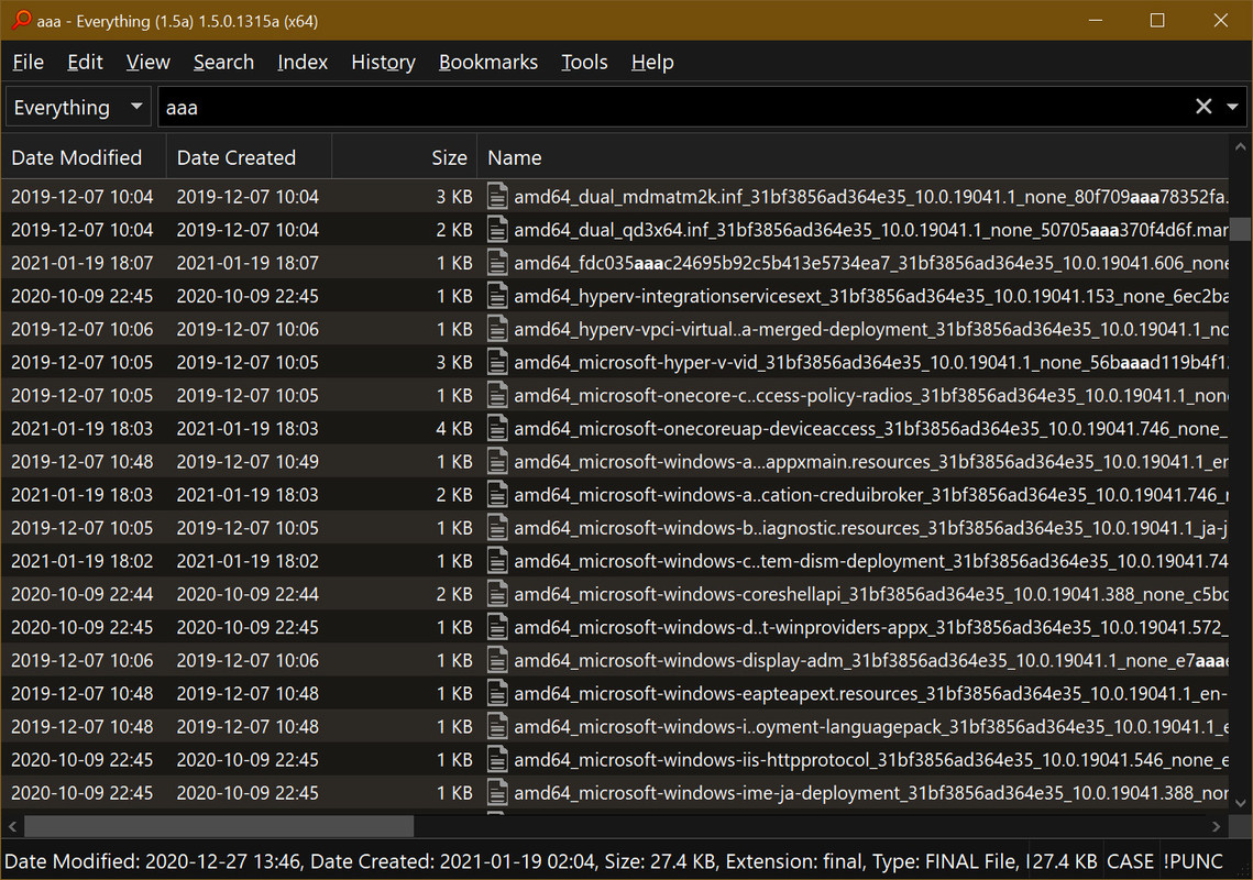
If such filters are indeed selected / turned on, then they show up in an abbreviated form written in capitals in the right bottom corner - i.e. on the right edge of the Status Bar. And that is very handy, as seen in exhibit A:
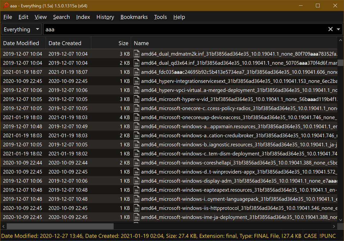
But although currently users are able to make the Status Bar stand out from rows of signs visible in the main window - it does not help a bit in noticing such filters being turned on, to which attest exhibit B:
And as the color of all elements of Status Bar are governed by one overall settings available at
Tools > Options > General > Fonts and Colors > Item > Status Bar
thus I propose adding something like
Menu > Tools > Options > General > Fonts and Colors > Item > Status Bar - Filters' Status
or in a more advanced version something like
Menu > Tools > Options > General > Fonts and Colors > Item > Status Bar - Status Of Match Filters
Menu > Tools > Options > General > Fonts and Colors > Item > Status Bar - Status Of Ignore Filters
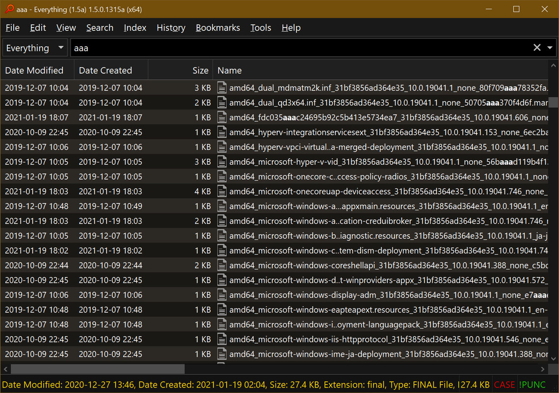
I personally would use color red for the first one and green for the second one, as seen in exhibit C:
And that is because those filters are easily forgettable [being turned on] - thus they must stand out from the rest of information provided by the Status Bar. If user forgets about them and do not notice them in the corner, then any search result can be compromised and [what is worse] unknowingly accepted as correct ones by a user
To rest my case I present to you an animated comparison of possible visual changes of the very same content:

[exhibit D]